

Client_Agriture Inc.
Location_Kyoto, Japan
Art direction, Design, Photo_Takashi Kuroyanagi
Design_Ayano Yamaura, *Akira Mima
Copywriting_*socko
*external staff
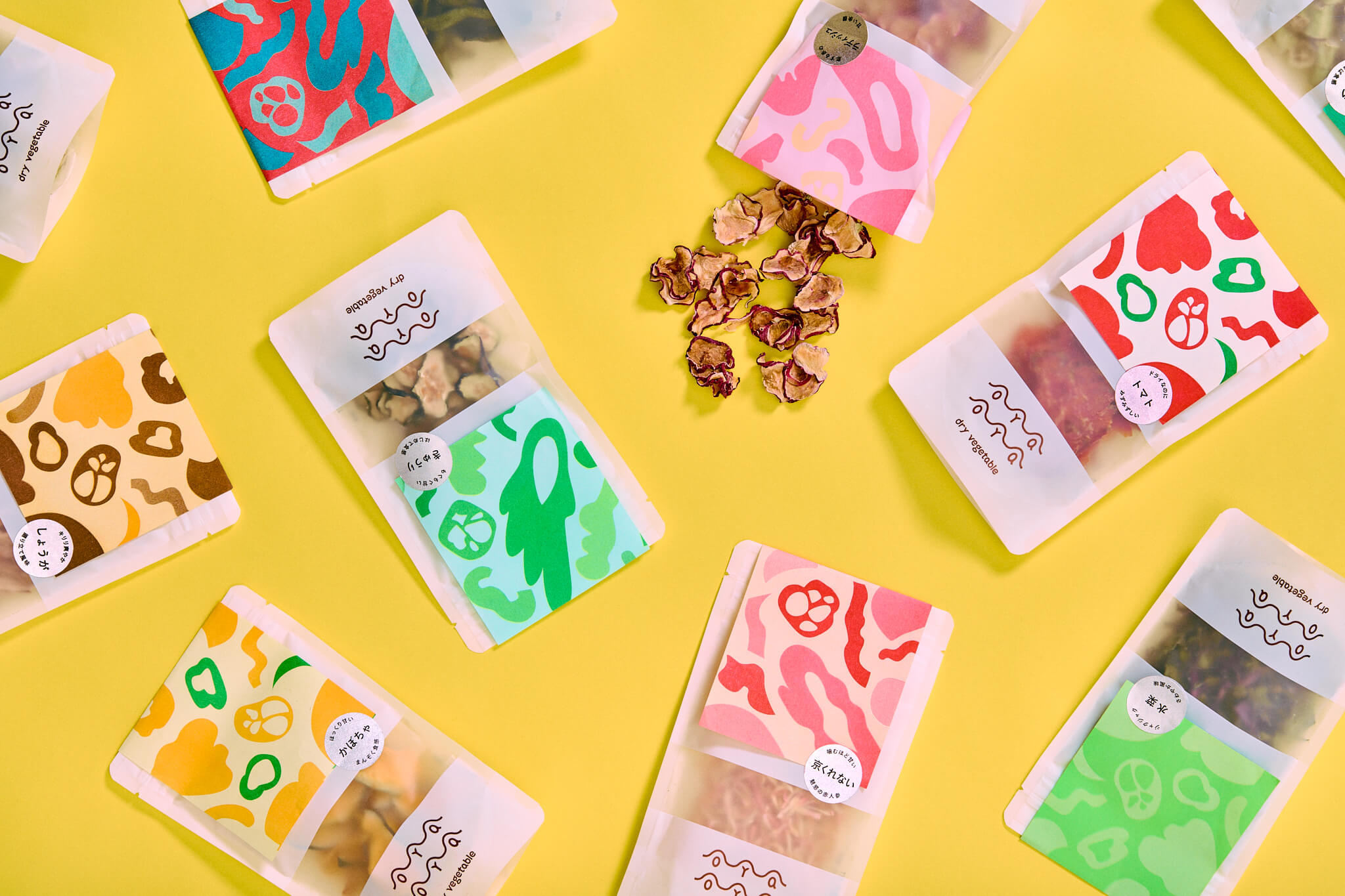
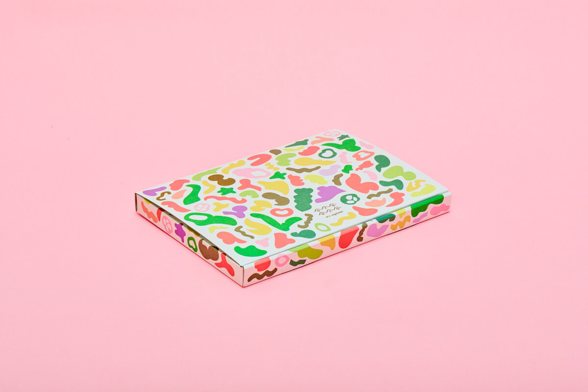
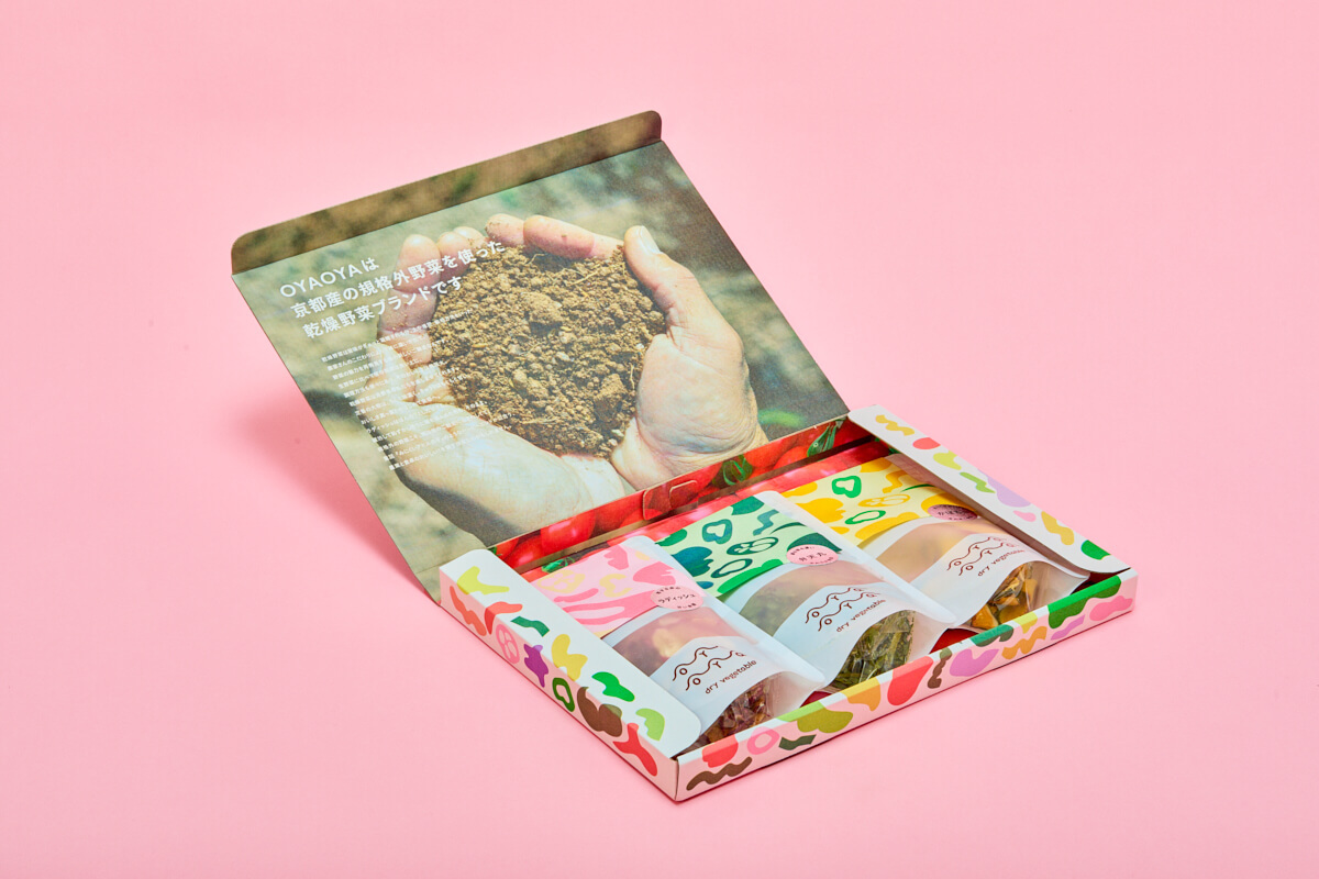
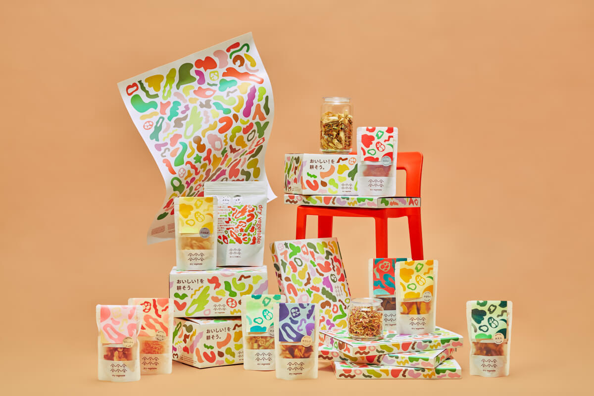
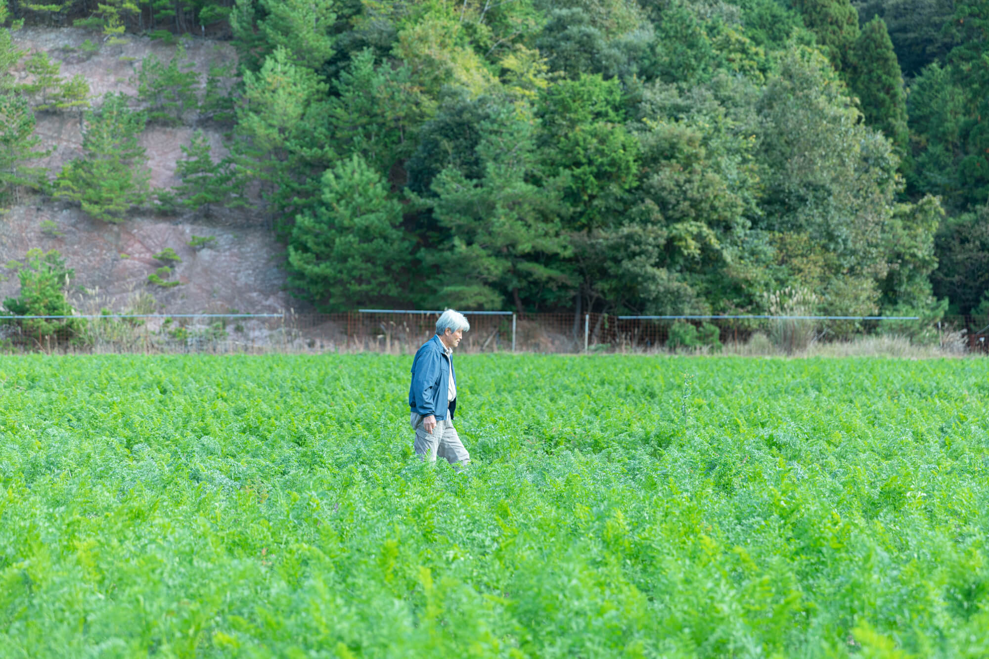
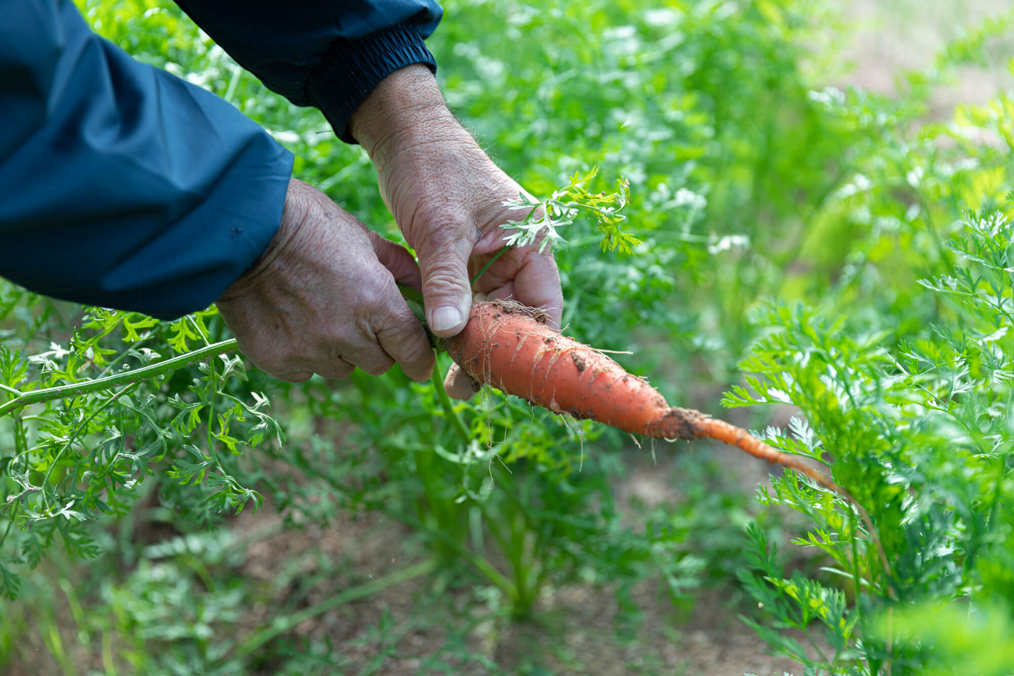
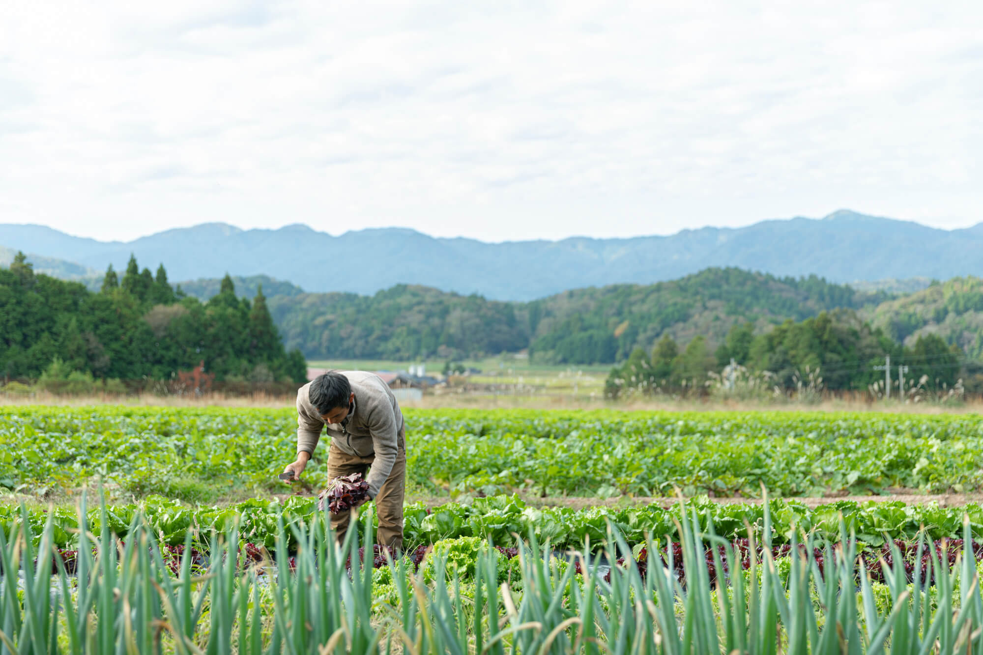
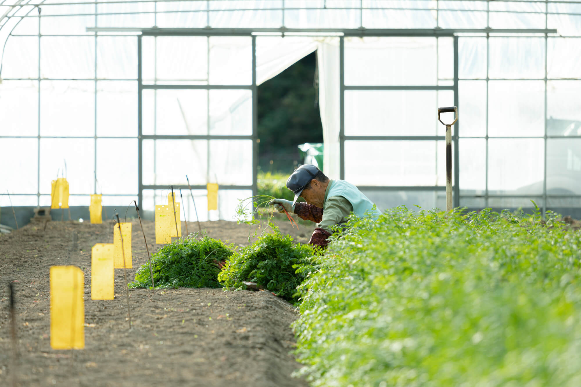
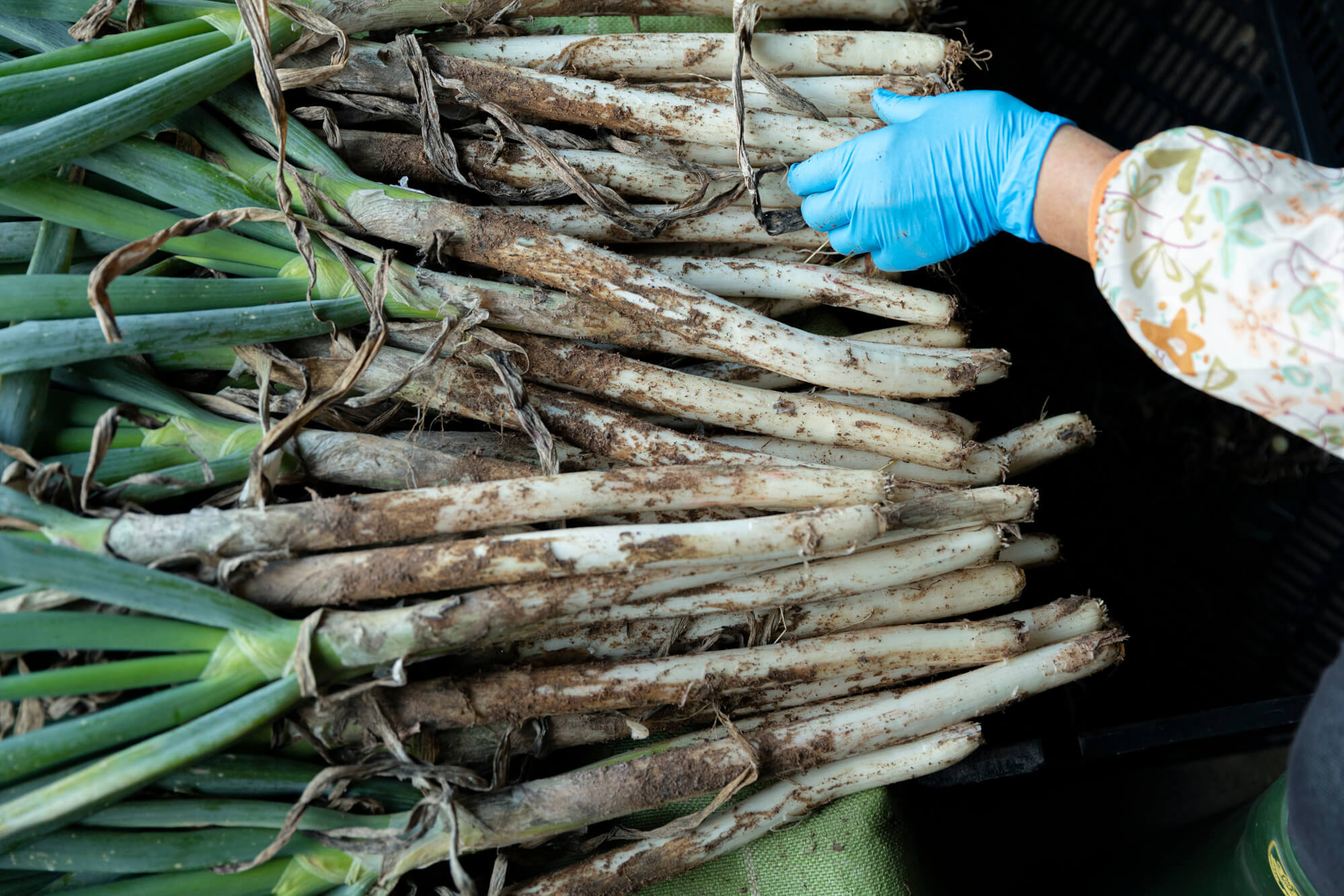
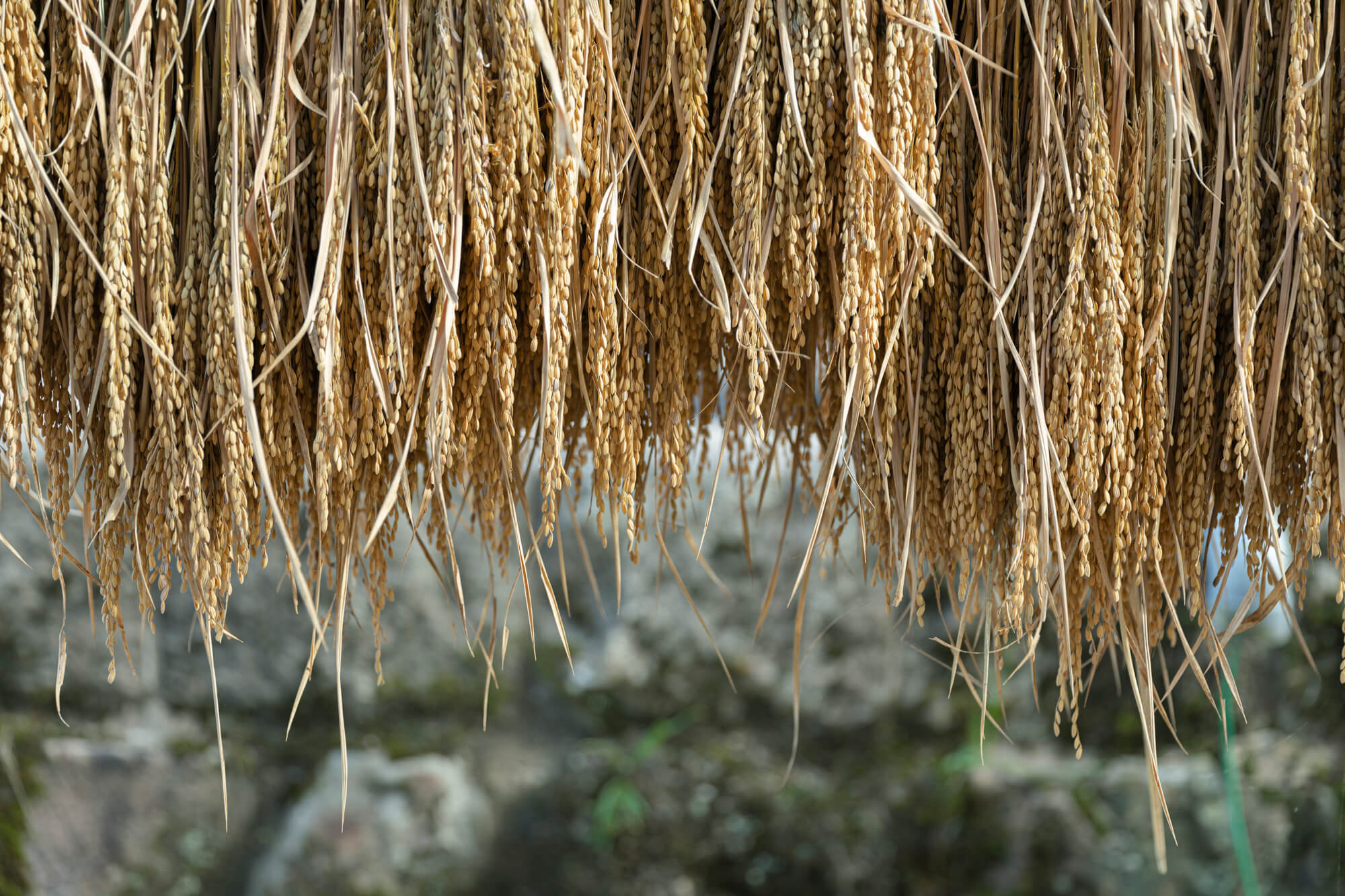
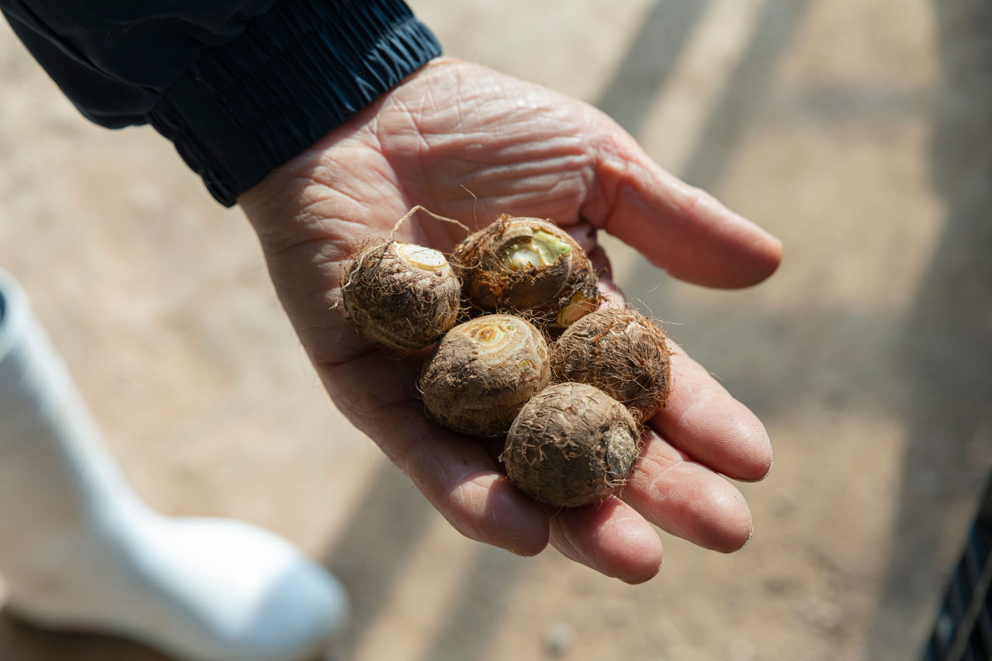
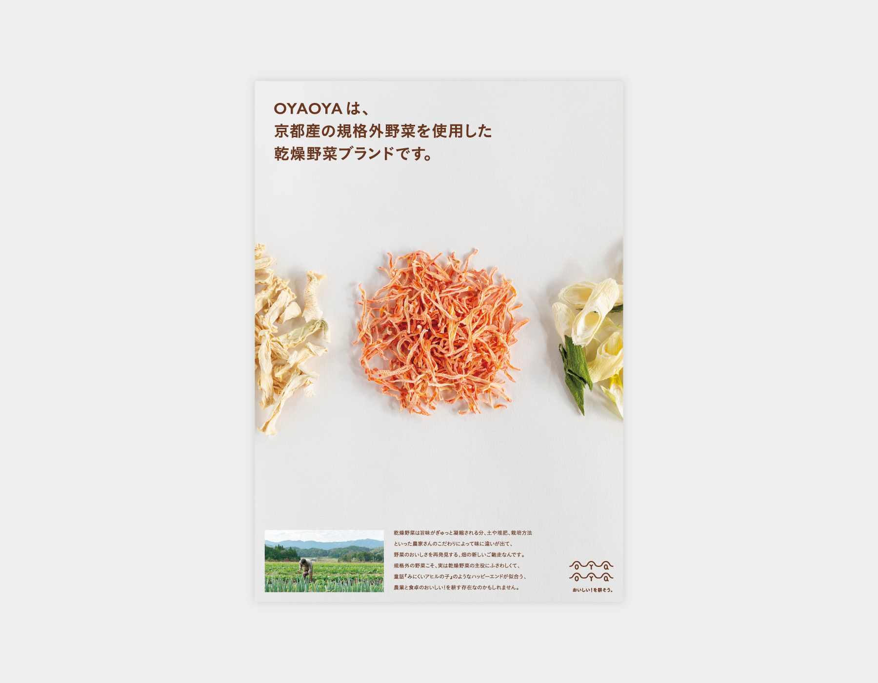
Naming, art direction, logo, package, and poster design, product copy direction, and photography for social media and pamphlets for OYAOYA, a dried vegetable brand using oddly shaped vegetables produced in Kyoto.
With our playful and vivid packages, we aim to restore the value of Oyaoya’s dried vegetables. Even though these vegetables are rich in flavor and nutrition, they are usually disposed or cheaply processed only because of their unconventional shapes and sizes. With this brand, we want to raise awareness for the issues of food loss and the survival of local agriculture.
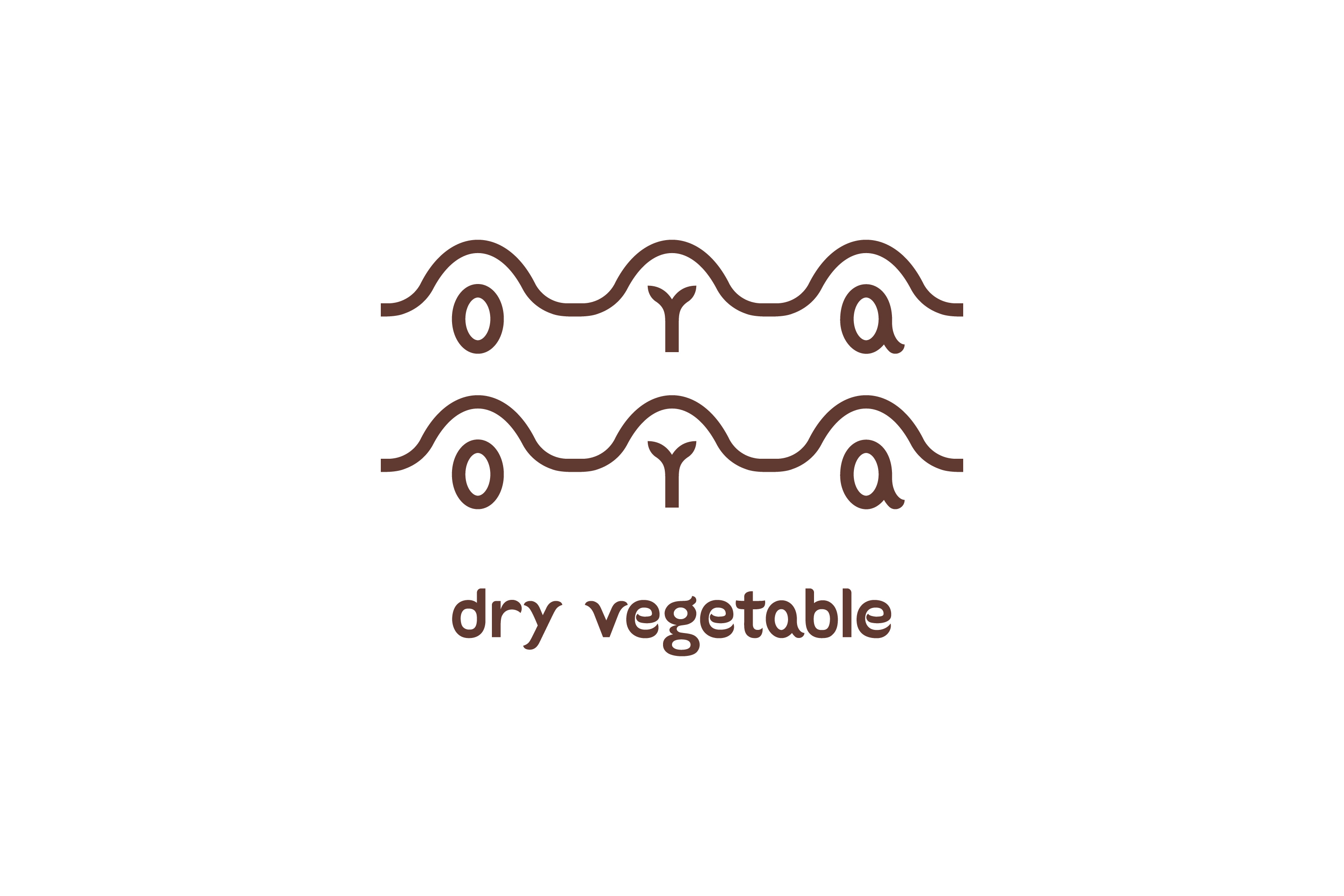
The brand logo represents seeds sprouting in ridges. For the cover label, we developed a printing and layout system that allows us to produce a variety of compositions. Therefore, each product has its unique color pattern – just like the diverse shapes of the vegetables.
- Topawards Asia Winners
- JAPAN PACKAGE DESIGN AWARDS, Selected
- Japan Typography Annual 2022, Selected
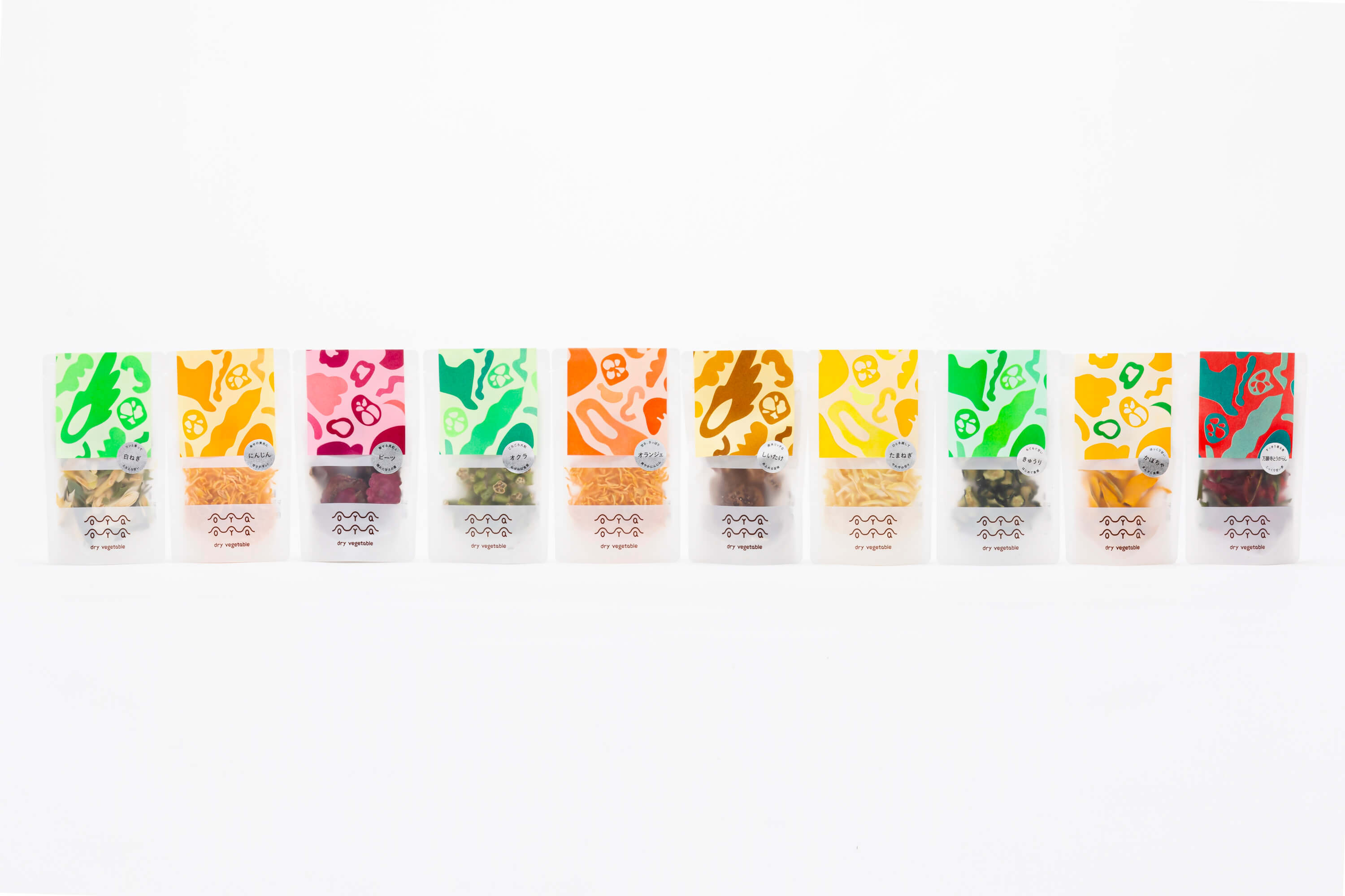
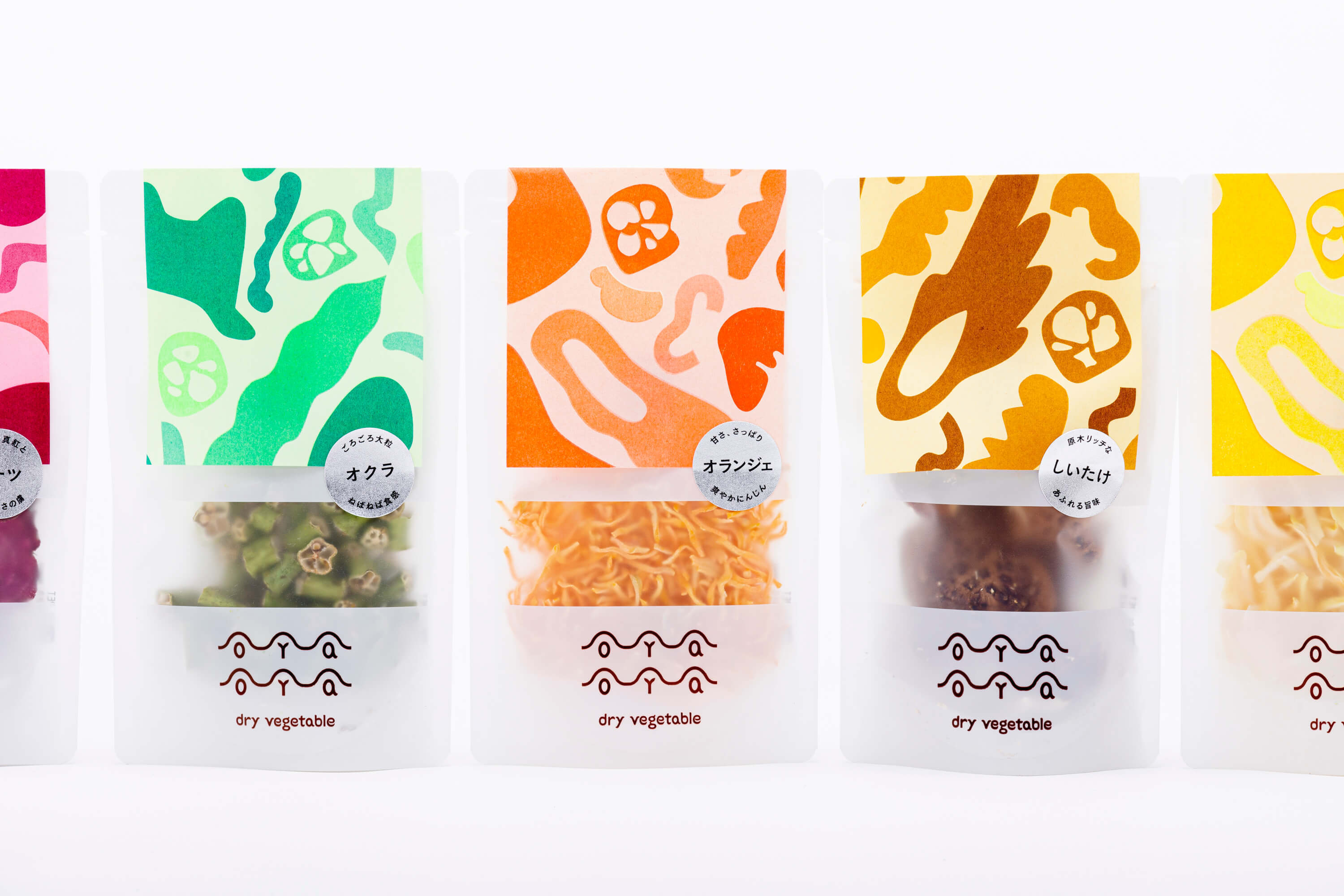
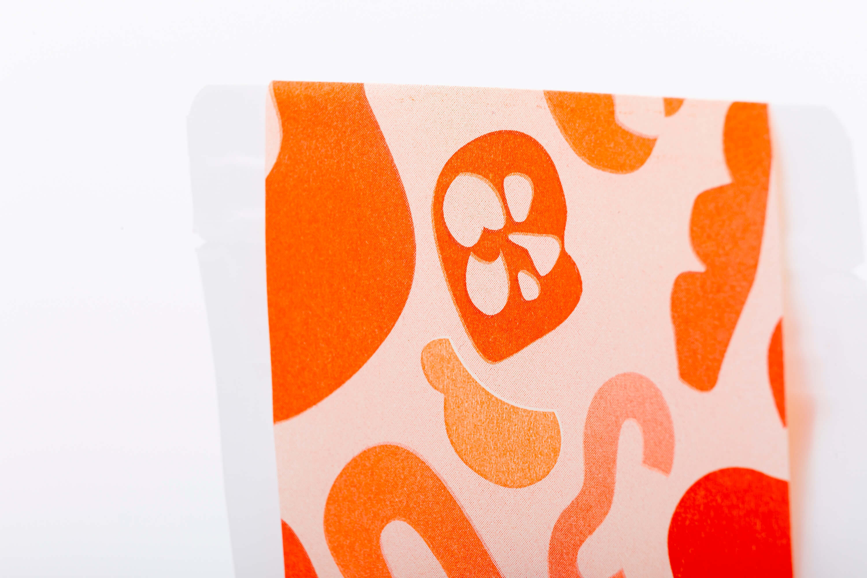
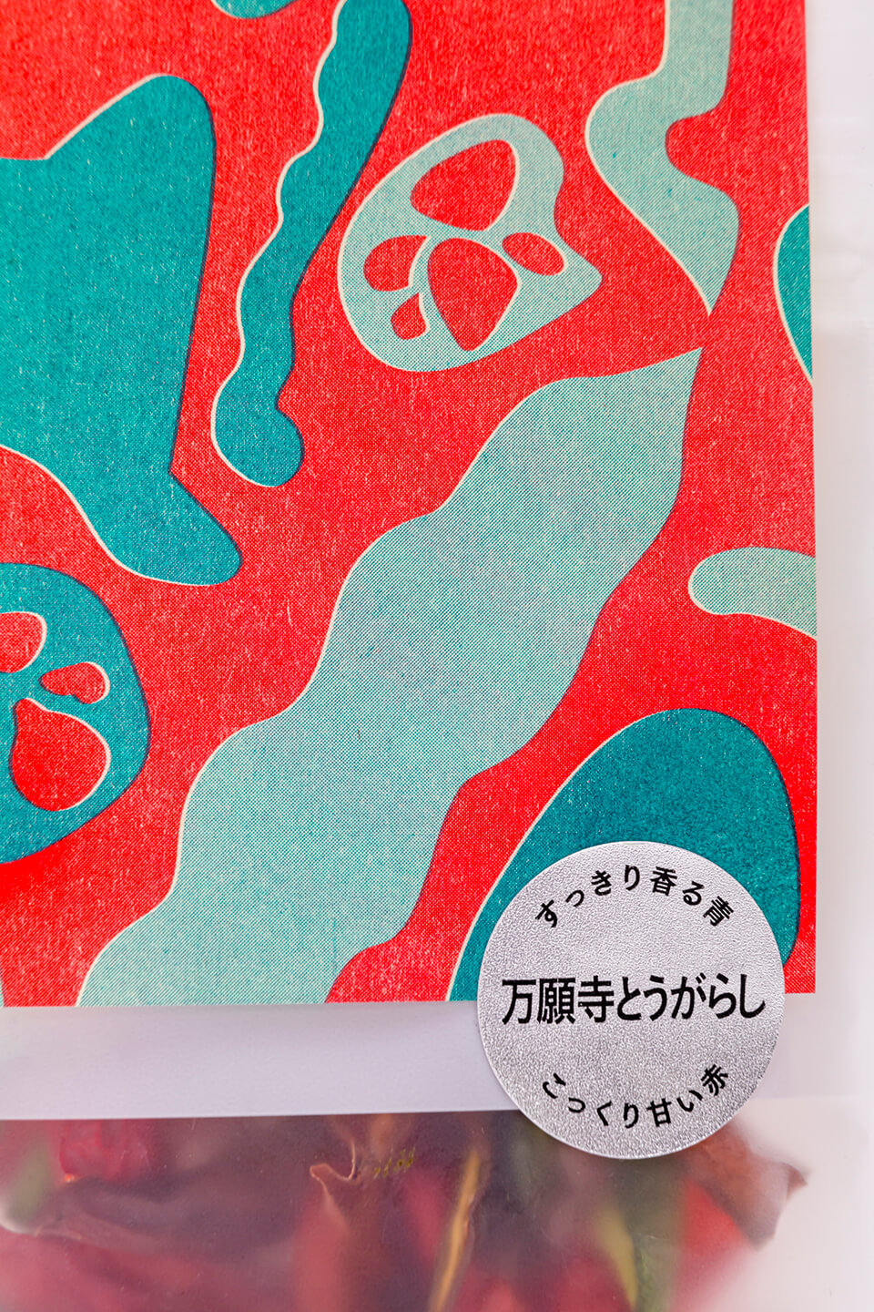
カバー部分は乾燥野菜をデフォルメした形を配置し、【規格外】を表現するためにズレやかすれの生じるリソグラフを用いて印刷した。
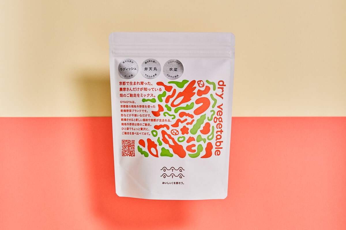 大袋デザイン
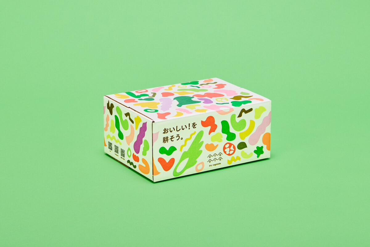 60サイズ ダンボールデザイン
 クリックポストサイズ ダンボールデザイン
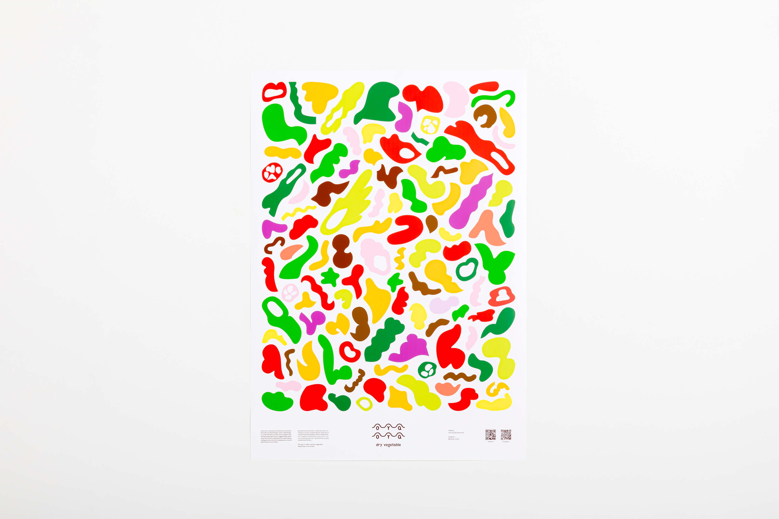
 展示会のためのA3パネル
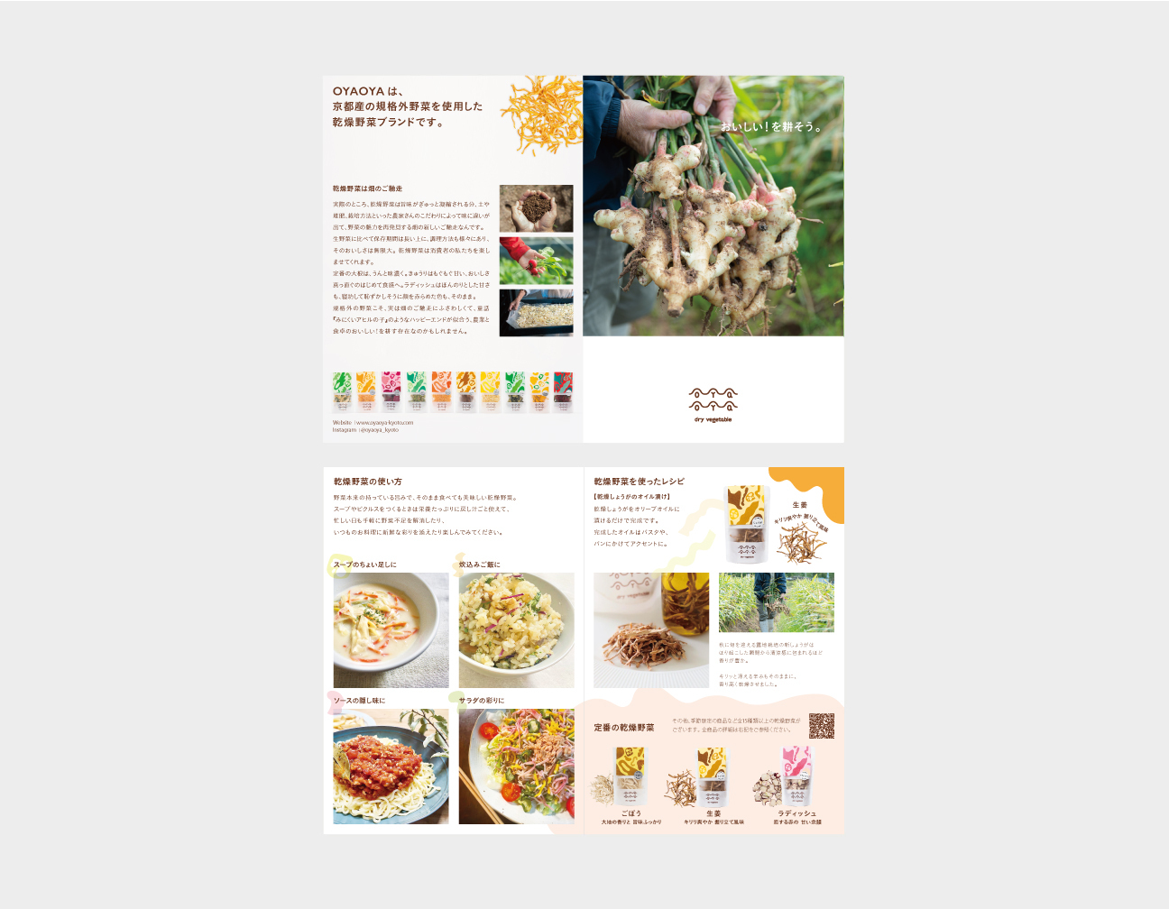
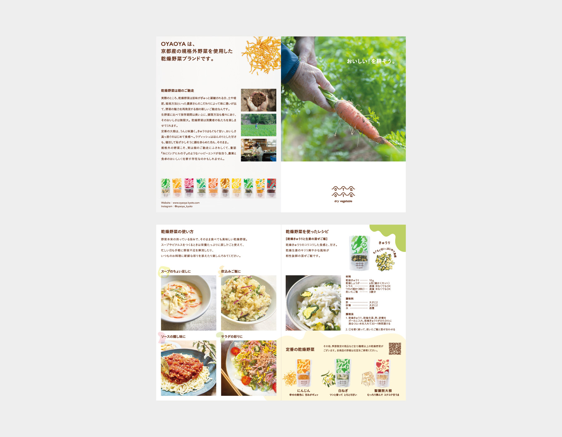 使用方法を伝えるための2つ折り小冊子(季節別)