Letter from japanese pear
Branding, CI / VI, Package, Photo
Client_Agriture Inc.
Location_Kyoto, Japan
Art direction_Takashi Kuroyanagi
Design_Yukie Katayama
Copywriting_*socko
Film photo_*Takayuki Nakashima
*external staff
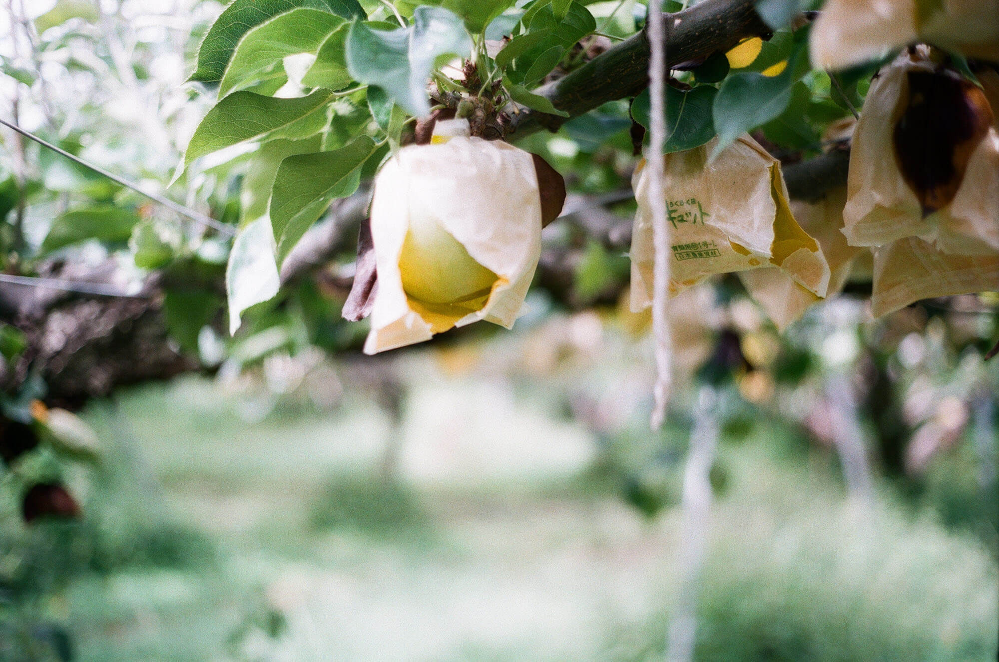
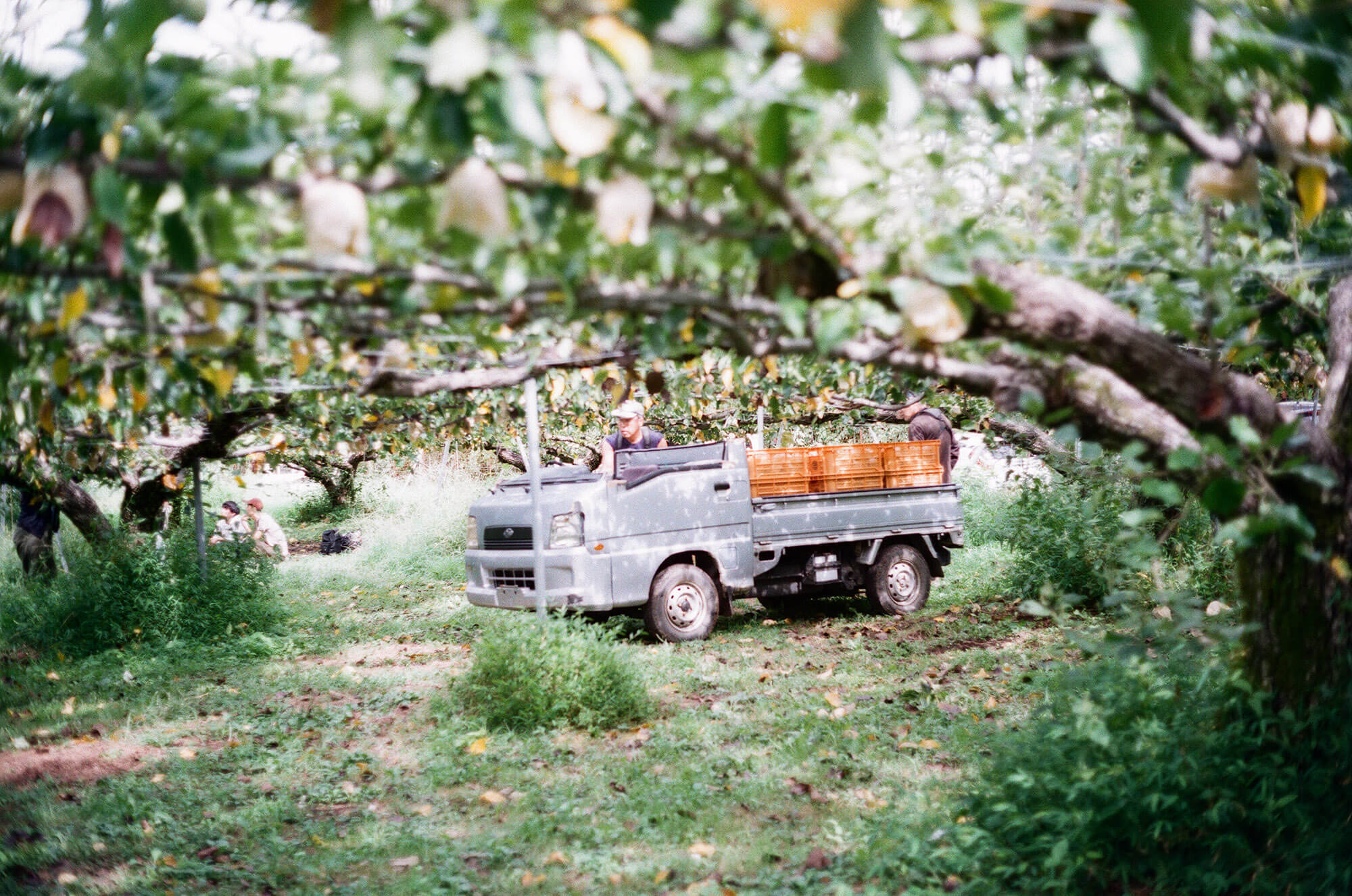
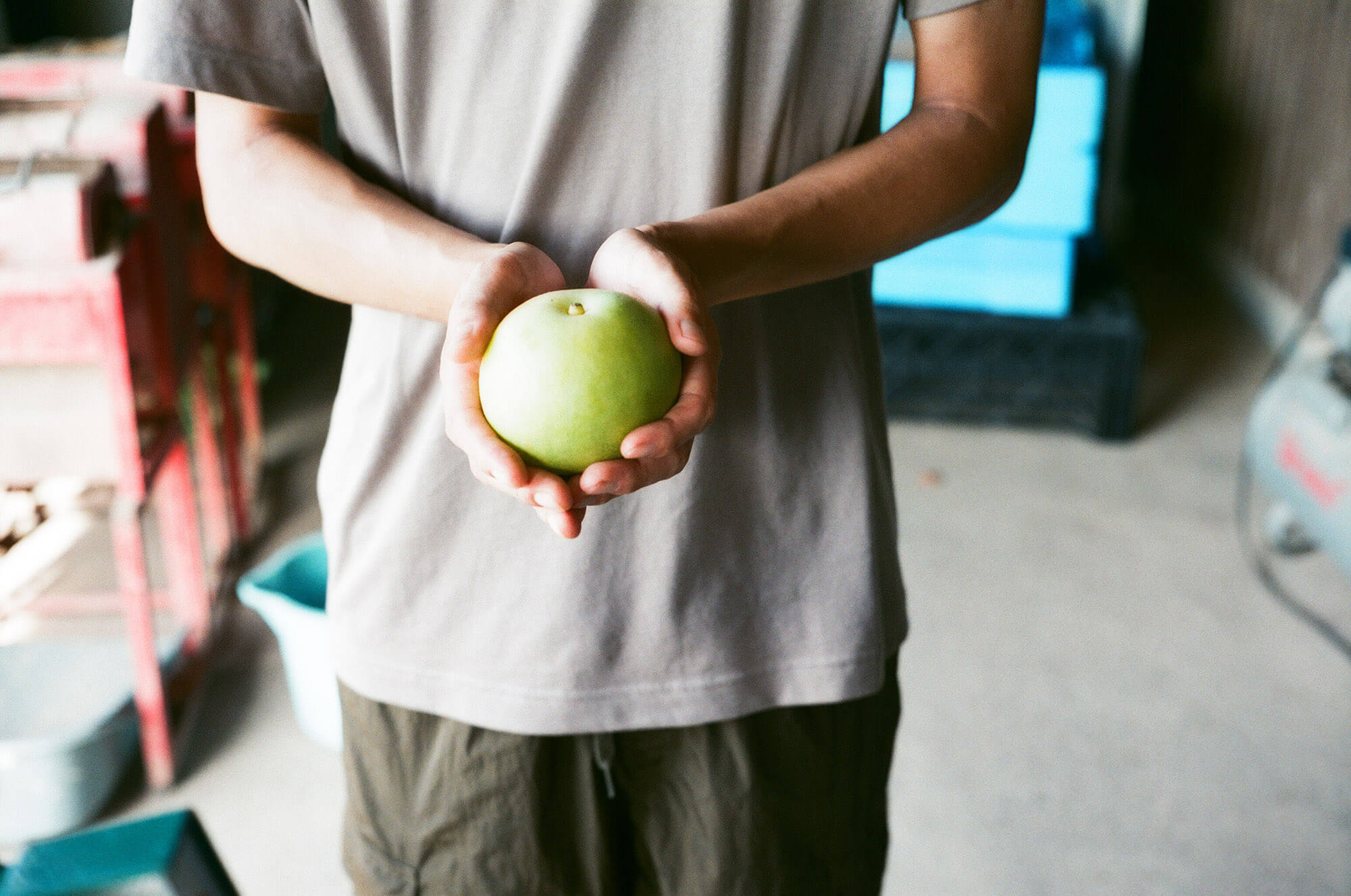
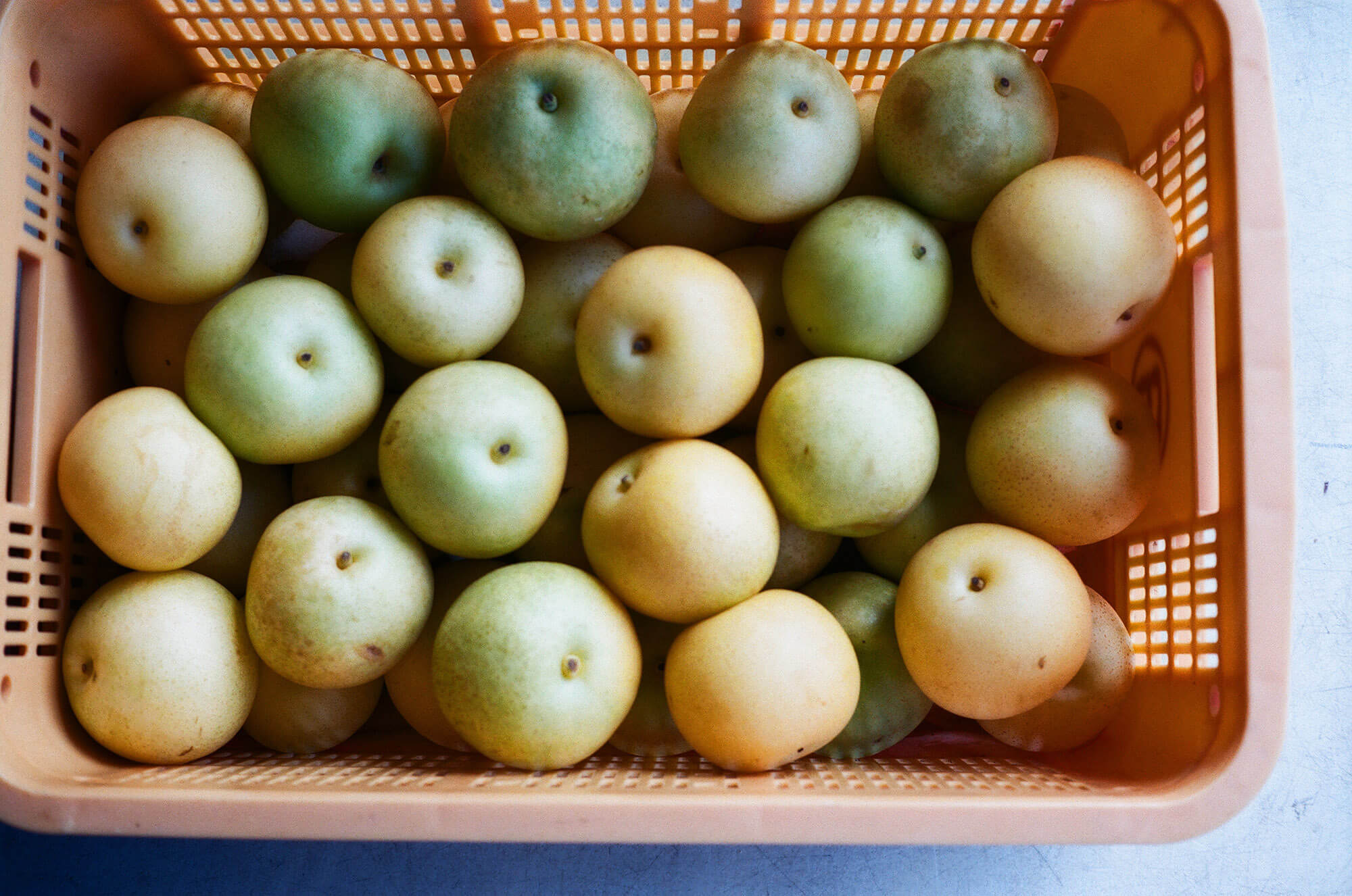
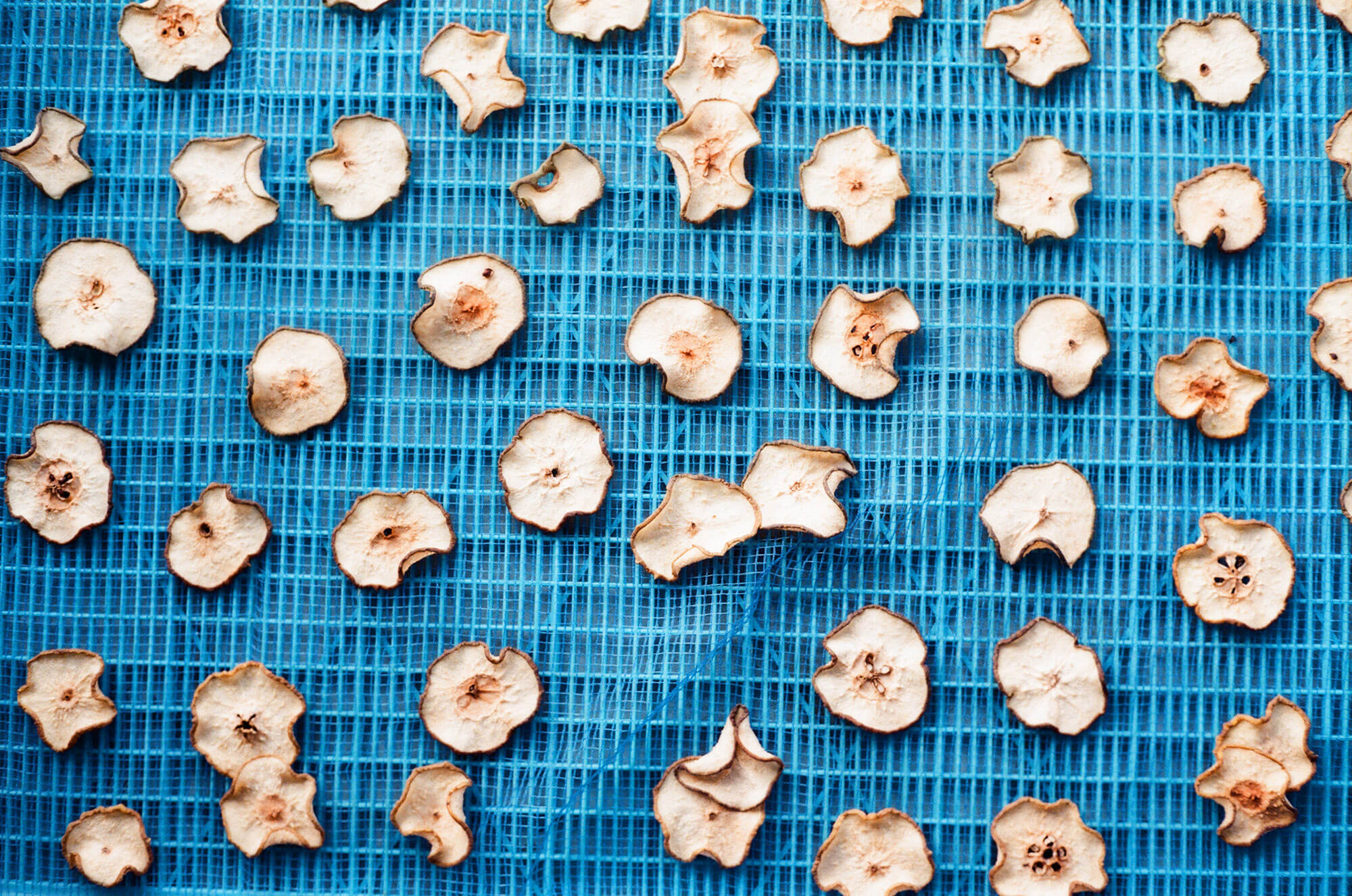
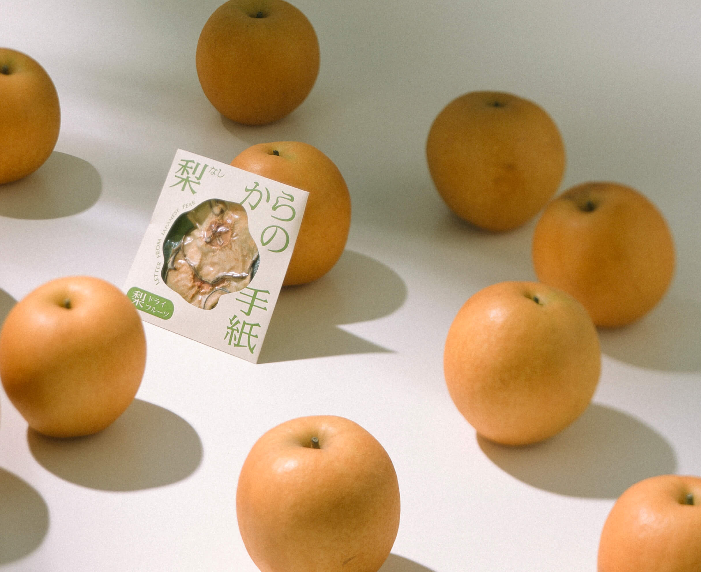
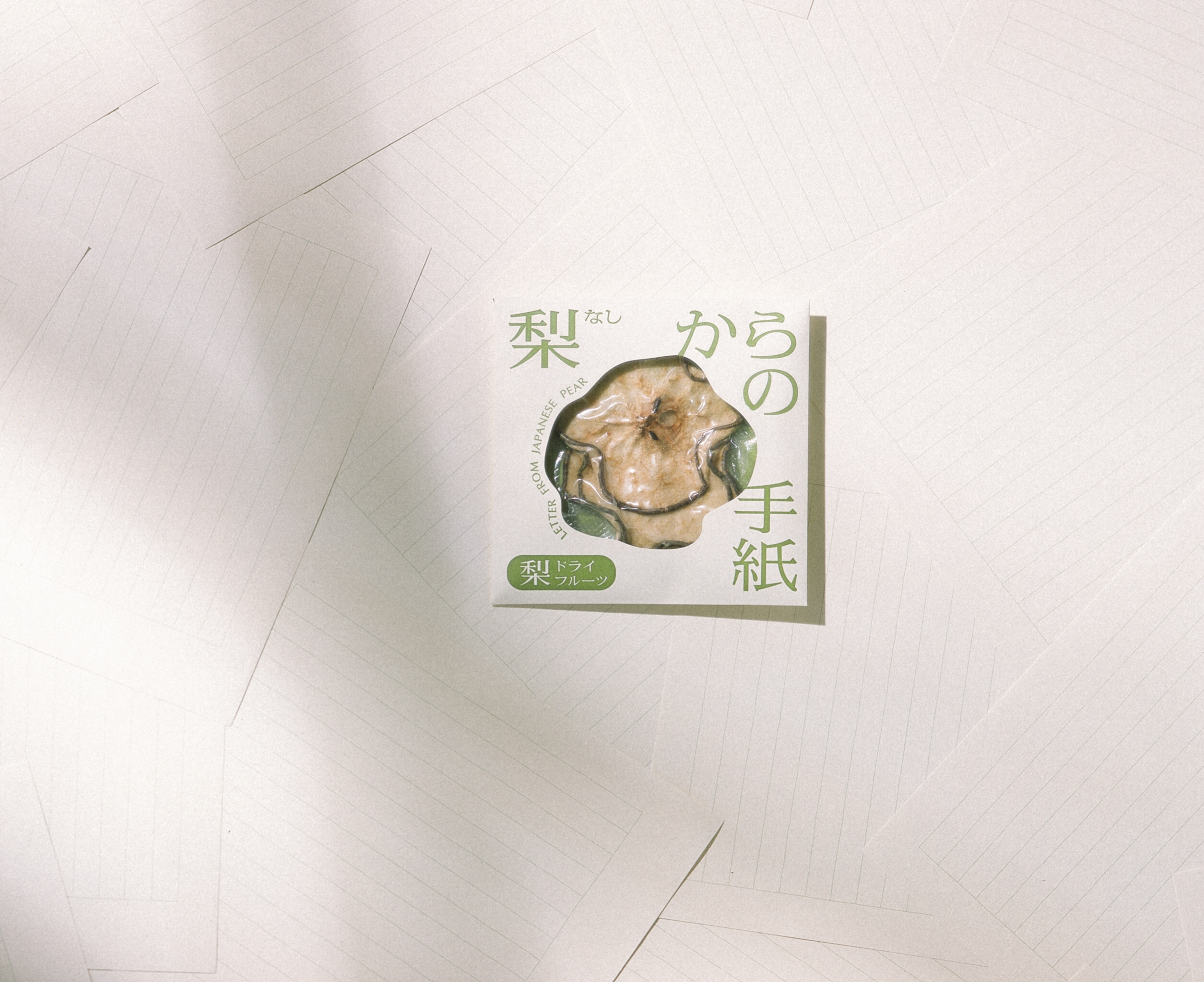
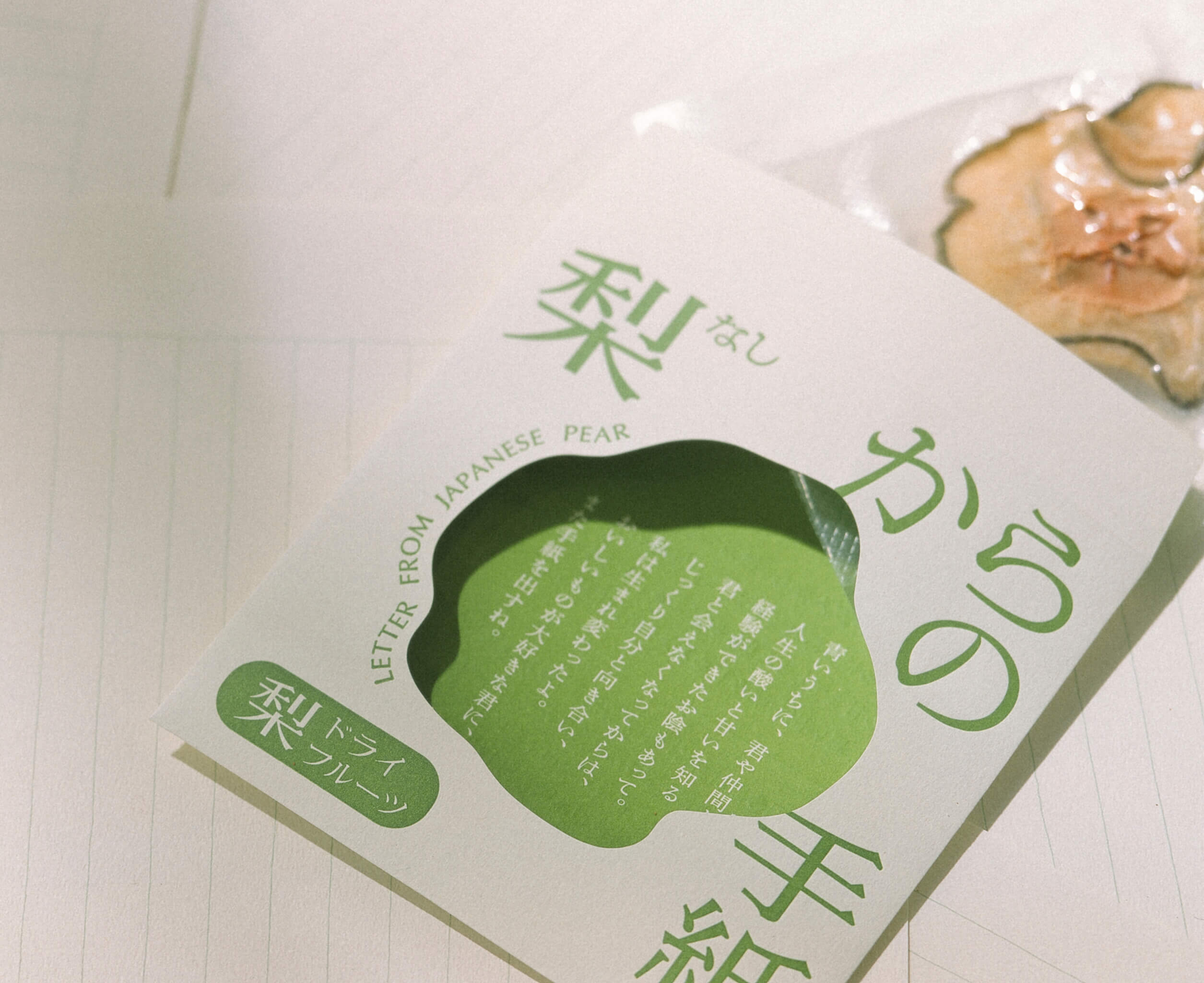
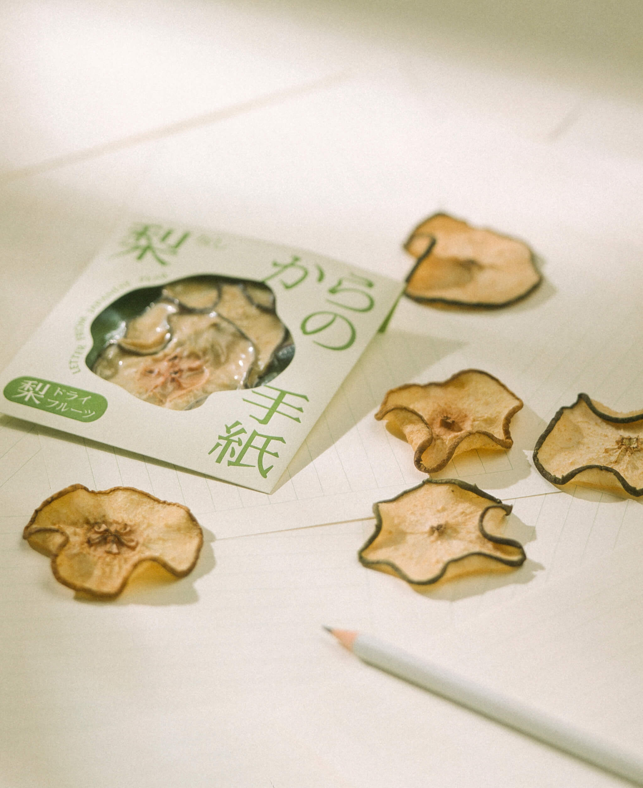
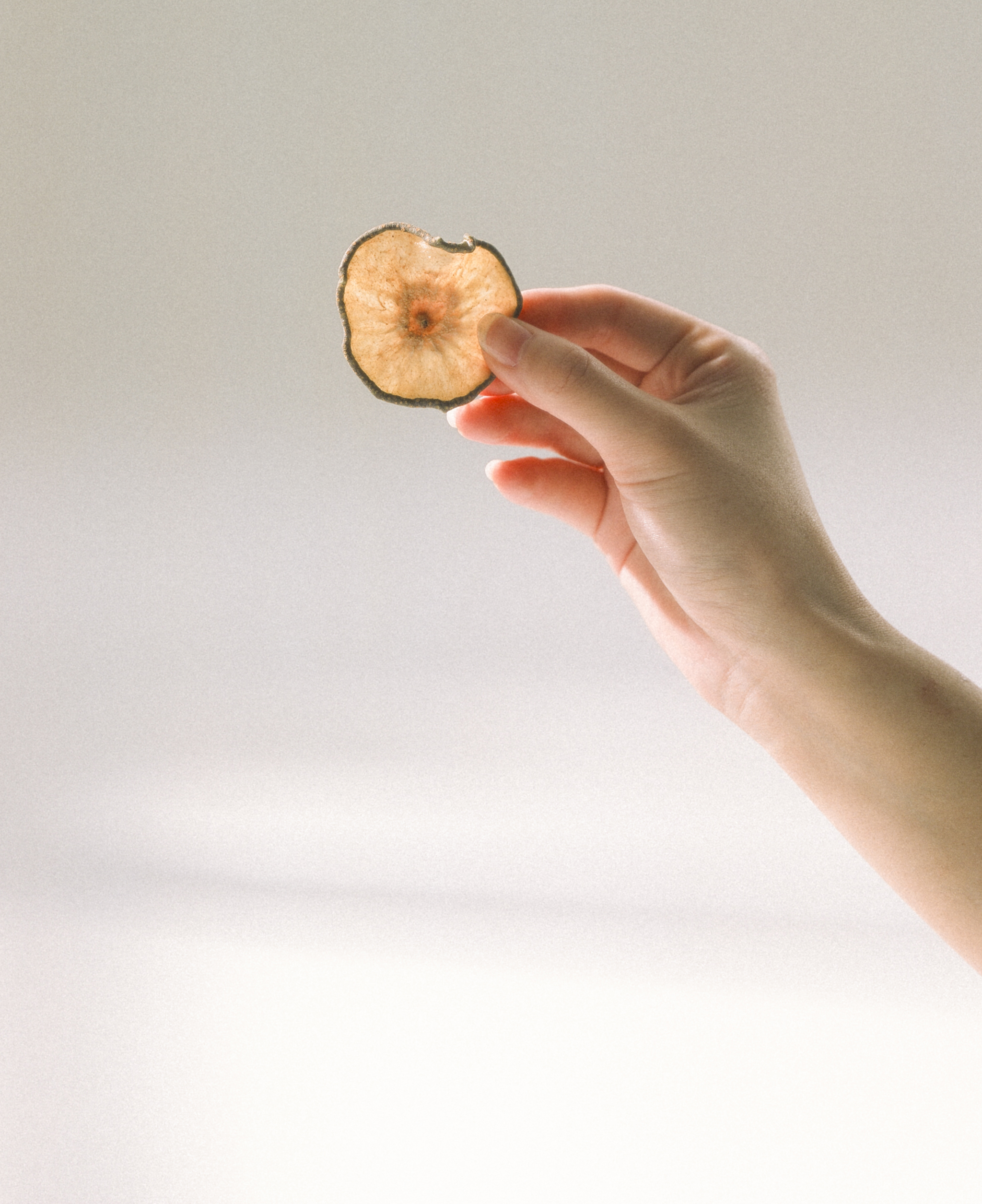
Branding design for "Letter from Pear", a dried fruit made from 20th Century Pears.
Art direction, naming, logo design, and package design were done by overlaying the dried pear, which exudes sweetness as it is chewed, on a letter.
The package was designed in the shape of a letter, using dried pears as the letterhead. The front of the package is hollowed out in the organic shape of the dried pear, creating a coexistence of nostalgia and novelty.
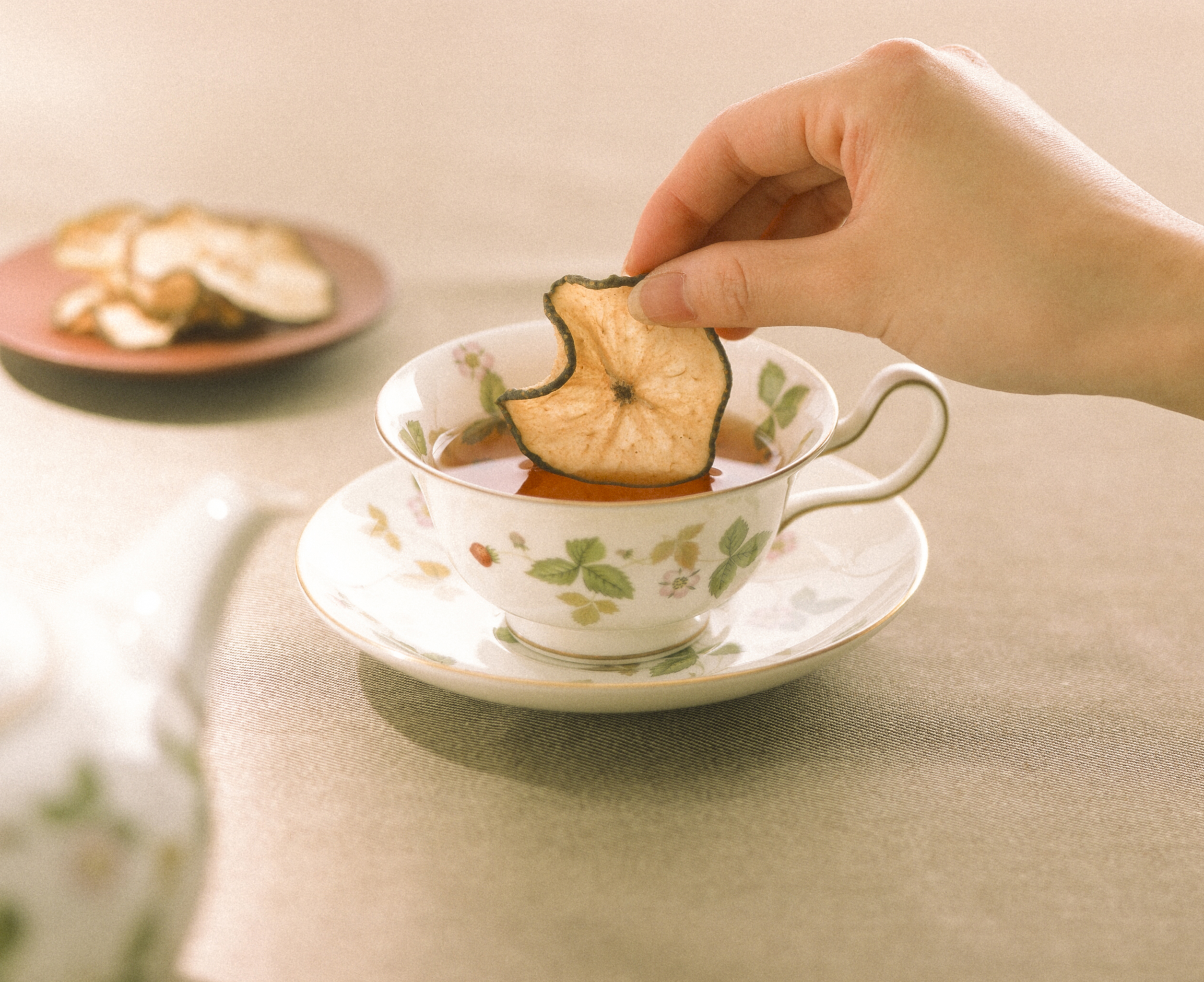
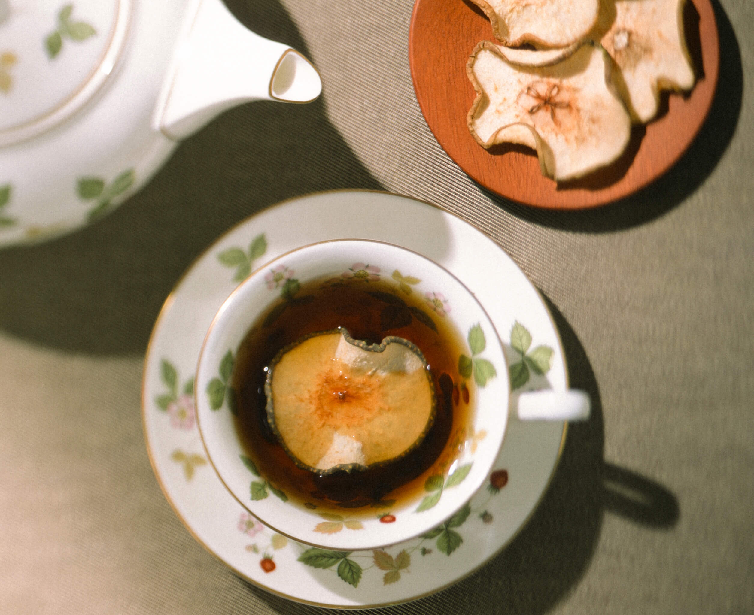
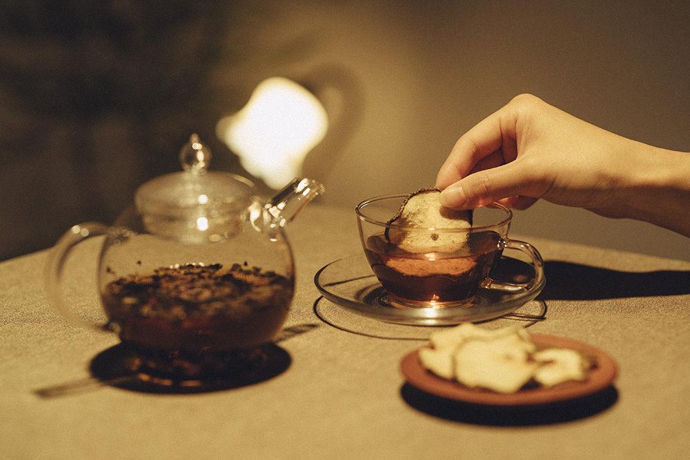
The photographs were taken with several types of film cameras, with an awareness of the textures of the twentieth century.